
CRO Examples: What Great CRO Looks Like
Great CRO looks like clarity, not decoration: a headline that states the outcome in plain language, a form that only asks what’s needed right now, a price that’s explained before it’s requested. The patterns below are illustrative — composites of the kind of changes we test on client sites at Salterra Digital Services and walk students through in the SEO University CRO track — not verified results from a single named business.
Use them as a gallery of testable patterns organized by the lever they pull, not a checklist to copy blindly. What made each pattern work was the specific friction it addressed on that specific page; your version of the fix should come from your own research, with these as a starting hypothesis.
What "Great CRO" Actually Looks Like
The common thread across strong CRO work isn’t a visual style — it’s that the page answers the visitor’s actual question faster than the alternative they’d otherwise consider. A cluttered page can convert well if it answers fast; a beautifully designed page can convert poorly if the visitor has to hunt for the price, the next step, or a reason to trust the business.
Great CRO is also incremental and evidence-based rather than a single bold redesign. The examples below are typically the product of a research-test-learn cycle, not a one-time creative decision, even when the final version looks like an obvious call in hindsight.
Clarity Over Cleverness: Value Proposition Examples
Consider a B2B software landing page whose original headline read something like “Next-Generation Workflow Intelligence Platform” — accurate to the product, meaningless to a first-time visitor trying to decide whether to keep reading. A revised version stating the outcome plainly, something closer to “Cut invoice approval time from days to hours,” gives a visitor an immediate reason to stay, because it answers “what’s in it for me” without requiring them to translate marketing language first.
A second illustrative pattern: a local service business replacing a generic “Quality You Can Trust” hero line with a specific claim tied to a guarantee or a response-time commitment. Specificity does double duty — it persuades a human visitor faster, and it gives an AI system summarizing the page something concrete to quote instead of a vague claim it has to soften or omit.
- Outcome-first headlines consistently outperform feature-first or slogan-style headlines in this kind of test.
- Repeating the core value proposition near every major CTA, in slightly varied language, keeps the reason to act present through the whole page.
Trust Signals That Do Real Work
A common illustrative pattern: moving a testimonial from a dedicated “Reviews” page, which almost nobody visits before converting, to directly beside the primary CTA on the page where the decision actually happens. The content didn’t change — only the placement did — and that alone is frequently enough to move a hesitant visitor past the last moment of doubt.
Specificity matters as much as placement. “Trusted by hundreds of clients” persuades less than a named, attributed result: “Helped a 40-person accounting firm cut onboarding time by half, per their operations lead.” The second version is also easier for an AI-generated summary to lift accurately, since it has a concrete detail to reference rather than a vague claim to paraphrase or drop.
Author and company credentials near advice-driven content follow the same logic — a named practitioner with a stated background reads as more trustworthy than unattributed copy, to a human visitor and to any system evaluating the page’s expertise.
Form and Lead-Capture Patterns Worth Copying
An illustrative multi-step form pattern: replacing a single long form (name, email, phone, company size, budget, timeline, message) with a short first step asking only for email and the one qualifying question that matters most, followed by additional fields after that initial commitment. Completion rates on the first, low-friction step typically rise sharply, because the visitor has already invested a small amount of effort by the time the longer fields appear.
Another recurring pattern: adding a visible microcopy line near the submit button explaining exactly what happens next — “We’ll call within one business day, no obligation” — which reduces the anxiety that keeps a filled-out form from ever getting submitted. This costs nothing to build and is one of the highest-leverage, lowest-effort tests available on most lead forms.
Why this pattern generalizes
Every additional form field is a small, real tax on completion. The pattern that keeps winning across illustrative tests isn’t a clever trick — it’s simply asking for less, later, and explaining what happens after the ask.
Pricing and Offer Presentation
A recurring illustrative pattern on SaaS pricing pages: adding a short, plain-language explainer beneath each tier’s price answering the objection a visitor is most likely holding — “what happens if we outgrow this plan” or “can we cancel anytime.” Pages that address the objection directly, rather than relying on a testimonial to imply it’s fine, tend to reduce pricing-page exits.
For ecommerce, showing total cost — including estimated shipping — earlier in the journey, rather than revealing it for the first time at the final checkout step, is one of the most consistently validated patterns across illustrative tests of this kind. Visitors increasingly research total cost before committing any personal information, and a page that resolves that question early removes a reason to abandon and comparison-shop elsewhere.
- Anchoring a mid-tier plan as “most popular” only works when the underlying value genuinely supports that framing — a mismatch erodes trust fast once a visitor investigates further.
- Showing a monthly-equivalent price next to an annual price, when annual is cheaper, reduces the mental math a visitor has to do to see the savings.
Mobile-First Friction Fixes
An illustrative pattern worth testing on any mobile-heavy funnel: replacing a dense, desktop-style navigation menu with a simplified mobile version that surfaces only the primary conversion path, since every extra tap target on a small screen is a chance to lose the visitor to an unrelated page. Sites that see the majority of traffic on mobile often find their biggest remaining CRO gains here rather than in further desktop polish.
Tap target sizing is an easy-to-miss illustrative fix: buttons that work fine on a mouse cursor can be genuinely hard to hit accurately with a thumb, and mis-taps on a form or CTA are a quiet, hard-to-diagnose source of abandonment that heatmap and session-recording tools tend to surface clearly once you look.
Checkout and Booking Flow Patterns
A frequently validated illustrative pattern: adding a persistent progress indicator to a multi-step checkout or booking flow, so a visitor always knows how many steps remain. Uncertainty about flow length is a quiet abandonment driver, particularly on mobile, where a visitor can’t glance ahead the way they might scroll a desktop page to preview what’s coming.
Offering guest checkout, or a lightweight booking option that doesn’t require full account creation up front, is another recurring pattern — account creation is a legitimate business goal, but forcing it before the primary conversion often costs more completed transactions than it’s worth. A common variation tests offering account creation after the purchase or booking is confirmed instead of before.
What Great CRO Is Not
Great CRO is not a visually striking redesign that wins an industry award but never gets measured against a baseline. It’s not copying a competitor’s checkout flow because it looks polished, without knowing whether that flow was ever tested. And it’s not chasing a metric like click-through rate while revenue quietly stays flat — several of the patterns above only look “great” in hindsight because they were validated against a real baseline, not because they were clever on their own.
The examples in this article are meant to generate hypotheses, not templates to install unchanged. The specific fix that worked in one illustrative case addressed a specific friction point that showed up in that page’s data — your version needs the same evidence behind it before it earns a permanent spot on your site.
Frequently Asked Questions
Are these real, verified client results?
No. These are illustrative patterns drawn from the kind of CRO work we do at Salterra Digital Services and teach in the SEO University CRO track, framed generically rather than as specific, attributed client data.
Can I copy these examples directly onto my own site?
Treat them as hypotheses worth testing, not guaranteed wins. The pattern that worked in an illustrative case addressed a friction point specific to that scenario — validate the same friction exists on your page before assuming the fix will transfer.
Which example tends to have the broadest impact across business types?
Reducing form friction and showing total cost or next steps earlier in the journey both generalize unusually well, because "what happens next and what will this cost me" is close to a universal visitor concern regardless of industry.
Do these patterns still apply in an AI-driven search environment?
Yes, and a few matter more. Specific, attributed trust signals and outcome-first value propositions are easier for AI-generated summaries to quote accurately, which makes clarity a dual-purpose investment now.
How do I know if a pattern like this is worth testing on my site?
Check your own funnel and qualitative data first. If session recordings or funnel drop-off point toward the same friction a pattern above addresses, it's a strong candidate hypothesis; if your data points elsewhere, prioritize that instead.
Where can I see a full walkthrough of one of these patterns being tested end to end?
A complete illustrative walkthrough, from research through hypothesis, testing, and results analysis, is covered in this course track's dedicated CRO case study article — this piece is intentionally a broader gallery rather than one deep narrative.
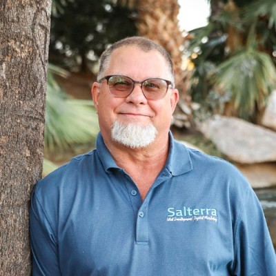
Terry has 30+ years in software and SEO. He’s the founder of Salterra Digital Services and SEO Spring Training, host of the Roundtable SEO Mastermind, and lead instructor at SEO University — teaching the exact tactics his team uses on client work.
Continue learning
Ready to master this?
This guide is one lesson from the Conversion Rate Optimization course. Get every lesson, framework and checklist — plus the full 38-course catalog — inside SEO University.
Practitioner-focused training across the full digital marketing stack — from technical SEO to conversion optimization and the AI search era. By Salterra Digital Services, since 2011.